
CYCLING TEAM BRANDING
CYCLING TEAM BRANDING
For a school project, I was tasked with branding a cycling team sponsored by none other than Cheetos. But instead of sticking to the brand’s usual look, I had to forget everything I knew about it and take things in a completely different direction. New color scheme, new vibe.
Client
School Project
Year
2024
Category
Branding

Design
Design
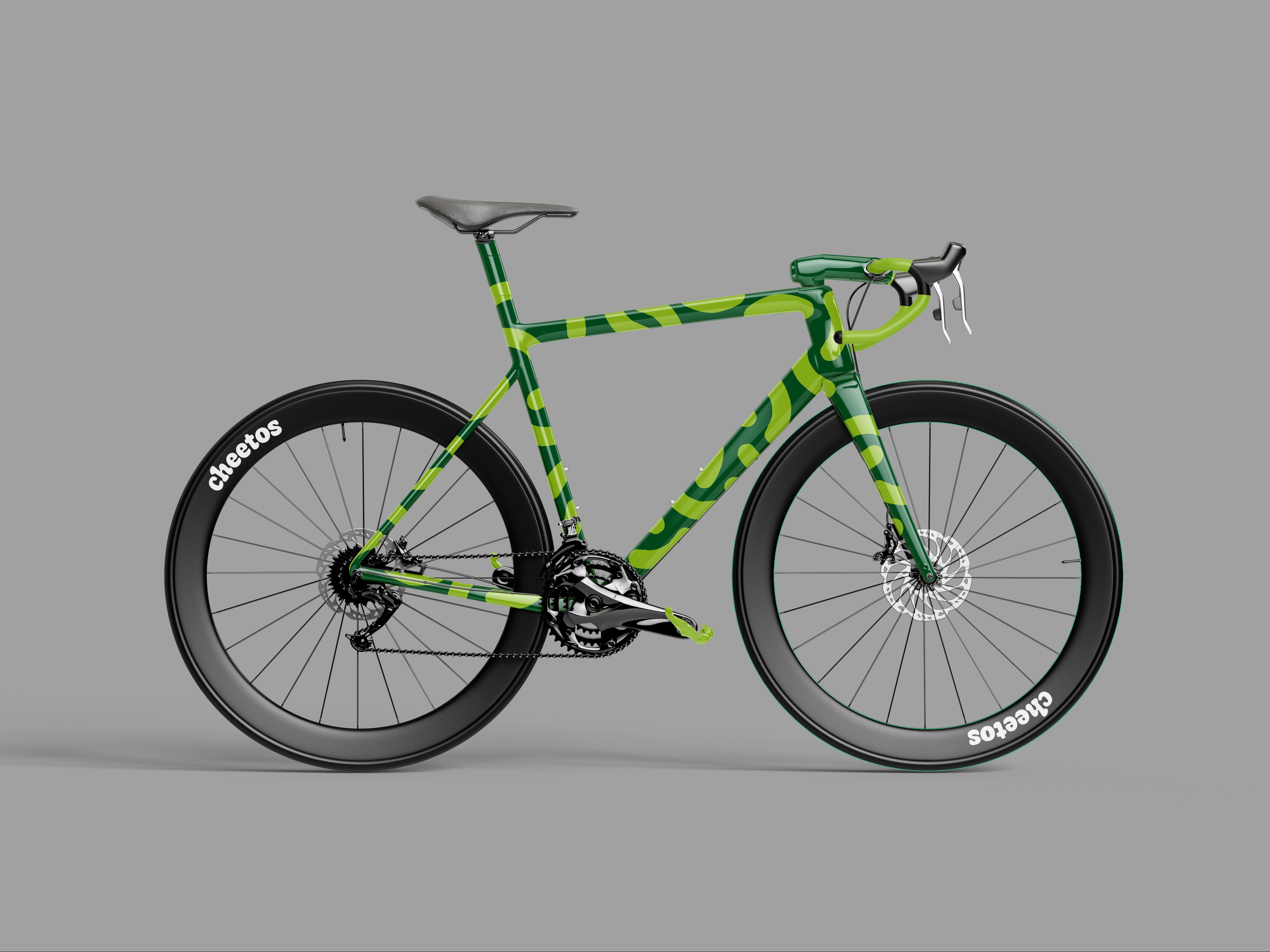
After countless concepts, a few headaches, and maybe a bit of overthinking, I finally landed on a solid idea. A great concept, bold patterns, a fresh color scheme, and some nice typography. I made it my mission to ditch the typical, boring cycling outfits and go for something different. The full kit came together, complete with a bike frame, team bus, cap, water bottle, you name it.
After countless concepts, a few headaches, and maybe a bit of overthinking, I finally landed on a solid idea. A great concept, bold patterns, a fresh color scheme, and some nice typography. I made it my mission to ditch the typical, boring cycling outfits and go for something different. The full kit came together, complete with a bike frame, team bus, cap, water bottle, you name it.
Design
After countless concepts, a few headaches, and maybe a bit of overthinking, I finally landed on a solid idea. A great concept, bold patterns, a fresh color scheme, and some nice typography. I made it my mission to ditch the typical, boring cycling outfits and go for something different. The full kit came together, complete with a bike frame, team bus, cap, water bottle, you name it.
Concept
Concept
When you think of Cheetos, you think of puffy chips, right? That’s exactly why I went with a puffy font. I also hand-drew a few elements to add a personal touch. The pattern, inspired by Cheetos, has a bit of texture, just enough to keep it from feeling too polished. The color scheme of black, white, green, lime green, and yellow works perfectly, making sure Cheetos stands out in the peloton like it belongs in the spotlight.
When you think of Cheetos, you think of puffy chips, right? That’s exactly why I went with a puffy font. I also hand-drew a few elements to add a personal touch. The pattern, inspired by Cheetos, has a bit of texture, just enough to keep it from feeling too polished. The color scheme of black, white, green, lime green, and yellow works perfectly, making sure Cheetos stands out in the peloton like it belongs in the spotlight.
Concept
When you think of Cheetos, you think of puffy chips, right? That’s exactly why I went with a puffy font. I also hand-drew a few elements to add a personal touch. The pattern, inspired by Cheetos, has a bit of texture, just enough to keep it from feeling too polished. The color scheme of black, white, green, lime green, and yellow works perfectly, making sure Cheetos stands out in the peloton like it belongs in the spotlight.


ZORANVISUALS
ZORANVISUALS
ZORANVISUALS
ZORANVISUALS
©2025 ZORANVISUALS
GO BACK TO TOP
©2025 ZORANVISUALS
GO BACK TO TOP
©2025 ZORANVISUALS
GO BACK TO TOP
©2025 ZORANVISUALS
GO BACK TO TOP